This post is about how control events, like MouseDoubleClick, MouseEnter ect., can be handled in a MVVM design

First a general Behaviour class

public static partial class Behaviours
{
	public static class EventBehaviourFactory
	{
		public static DependencyProperty CreateCommandExecutionEventBehaviour(RoutedEvent routedEvent, string propertyName, Type ownerType)
		{
			DependencyProperty property = DependencyProperty.RegisterAttached(propertyName, typeof(ICommand), ownerType,
				new PropertyMetadata(null,
					new ExecuteCommandOnRoutedEventBehaviour(routedEvent).PropertyChangedHandler));

			return property;
		}

		/// <summary>
		/// An internal class to handle listening for an event and executing a command,
		/// when a Command is assigned to a particular DependencyProperty
		/// </summary>
		private class ExecuteCommandOnRoutedEventBehaviour : ExecuteCommandBehaviour
		{
			private readonly RoutedEvent _routedEvent;

			public ExecuteCommandOnRoutedEventBehaviour(RoutedEvent routedEvent)
			{
				_routedEvent = routedEvent;
			}

			/// <summary>
			/// Handles attaching or Detaching Event handlers when a Command is assigned or unassigned
			/// </summary>
			/// <param name="sender"></param>
			/// <param name="oldValue"></param>
			/// <param name="newValue"></param>
			protected override void AdjustEventHandlers(DependencyObject sender, object oldValue, object newValue)
			{
				UIElement element = sender as UIElement;
				if (element == null) { return; }

				if (oldValue != null)
				{
					element.RemoveHandler(_routedEvent, new RoutedEventHandler(EventHandler));
				}

				if (newValue != null)
				{
					element.AddHandler(_routedEvent, new RoutedEventHandler(EventHandler));
				}
			}

			protected void EventHandler(object sender, RoutedEventArgs e)
			{
				HandleEvent(sender, e);
			}
		}

		internal abstract class ExecuteCommandBehaviour
		{
			protected DependencyProperty _property;
			protected abstract void AdjustEventHandlers(DependencyObject sender, object oldValue, object newValue);

			protected void HandleEvent(object sender, EventArgs e)
			{
				DependencyObject dp = sender as DependencyObject;
				if (dp == null)
				{
					return;
				}

				ICommand command = dp.GetValue(_property) as ICommand;

				if (command == null)
				{
					return;
				}

				if (command.CanExecute(e))
				{
					command.Execute(e);
				}
			}

			/// <summary>
			/// Listens for a change in the DependencyProperty that we are assigned to, and
			/// adjusts the EventHandlers accordingly
			/// </summary>
			/// <param name="sender"></param>
			/// <param name="e"></param>
			public void PropertyChangedHandler(DependencyObject sender, DependencyPropertyChangedEventArgs e)
			{
				// the first time the property changes,
				// make a note of which property we are supposed
				// to be watching
				if (_property == null)
				{
					_property = e.Property;
				}

				object oldValue = e.OldValue;
				object newValue = e.NewValue;

				AdjustEventHandlers(sender, oldValue, newValue);
			}
		}
	}
}

The ControlEventBehaviour class

public class ControlEventBehaviour
{
	#region Button
	public static readonly DependencyProperty MouseEnterCommand = Behaviours.EventBehaviourFactory.CreateCommandExecutionEventBehaviour
			 (Button.MouseEnterEvent, "MouseEnterCommand", typeof(ControlEventBehaviour));

	public static void SetMouseEnterCommand(DependencyObject o, ICommand value)
	{
		o.SetValue(MouseEnterCommand, value);
	}

	public static ICommand GetMouseEnterCommand(DependencyObject o)
	{
		return o.GetValue(MouseEnterCommand) as ICommand;
	}

	public static readonly DependencyProperty MouseLeaveCommand = Behaviours.EventBehaviourFactory.CreateCommandExecutionEventBehaviour
		 (Button.MouseLeaveEvent, "MouseLeaveCommand", typeof(ControlEventBehaviour));

	public static void SetMouseLeaveCommand(DependencyObject o, ICommand value)
	{
		o.SetValue(MouseLeaveCommand, value);
	}

	public static ICommand GetMouseLeaveCommand(DependencyObject o)
	{
		return o.GetValue(MouseLeaveCommand) as ICommand;
	}

	public static readonly DependencyProperty MouseDoubleClickCommand = Behaviours.EventBehaviourFactory.CreateCommandExecutionEventBehaviour
		 (Button.MouseDoubleClickEvent, "MouseDoubleClickCommand", typeof(ControlEventBehaviour));

	public static void SetMouseDoubleClickCommand(DependencyObject o, ICommand value)
	{
		o.SetValue(MouseDoubleClickCommand, value);
	}

	public static ICommand GetMouseDoubleClickCommand(DependencyObject o)
	{
		return o.GetValue(MouseDoubleClickCommand) as ICommand;
	}
	#endregion Button
}

The shown example only handle button events, but with slight modification can be used for all WPF controls.

In the View:

<Button Command="{Binding Path=ButtonClickCommand}"
		utilities:ControlEventBehaviour.MouseEnterCommand="{Binding Path=MouseEnter}"
		utilities:ControlEventBehaviour.MouseLeaveCommand="{Binding Path=MouseLeave}"
		utilities:ControlEventBehaviour.MouseDoubleClickCommand="{Binding Path=ButtonDoubleClick}">

And finally in the ViewModel. This is only for MouseEnter, but I'm sure that you get the gist of it :)

private RelayCommand _mouseEnter = null;
public virtual RelayCommand MouseEnter
{
	get
	{
		if (_mouseEnter == null)
		{
			_mouseEnter = new RelayCommand(param =>
			{
				try
				{
				}
				catch { }
			}, param => { return true; });
		}
		return _mouseEnter;
	}
}

As always, feel free to comment, or ask.


Stright forward, but still ...

public static class Convert
{
	public static System.Windows.Media.ImageSource ConvertImage(System.Drawing.Image image)
	{
		try
		{
			if (image != null)
			{
				var bitmap = new System.Windows.Media.Imaging.BitmapImage();
				bitmap.BeginInit();
				System.IO.MemoryStream memoryStream = new System.IO.MemoryStream();
				image.Save(memoryStream, System.Drawing.Imaging.ImageFormat.Png);
				memoryStream.Seek(0, System.IO.SeekOrigin.Begin);
				bitmap.StreamSource = memoryStream;
				bitmap.EndInit();
				return bitmap;
			}
		}
		catch { }
		return null;
	}
}

As always, feel free to comment, or ask.


TextBlock with vertical text

Published 10/31/2014 by Christian
Tags: ,

This will make the text in the TextBlock vertical

<TextBlock Text="Some Text">
	<TextBlock.LayoutTransform>
		<TransformGroup>
			<RotateTransform Angle="90" />
			<ScaleTransform ScaleX="-1" ScaleY="-1"/>
		</TransformGroup>
	</TextBlock.LayoutTransform>
</TextBlock>

As always, feel free to comment, or ask.


XAML style inheritance

Published 10/31/2014 by Christian
Tags: , ,

This makes the Bar style inherits from Foo

<ResourceDictionary x:Class="Baltz.Styles.Bar"
                    xmlns="http://schemas.microsoft.com/winfx/2006/xaml/presentation"
                    xmlns:x="http://schemas.microsoft.com/winfx/2006/xaml"
                    xmlns:mc="http://schemas.openxmlformats.org/markup-compatibility/2006" 
                    xmlns:d="http://schemas.microsoft.com/expression/blend/2008">
    <ResourceDictionary.MergedDictionaries>
        <ResourceDictionary Source="Foo.xaml"/>
    </ResourceDictionary.MergedDictionaries>
    <Style x:Key="aKey" BasedOn="{StaticResource StyleInFoo}" TargetType="{x:Type aType}">
        <Setter Property="aTypeProperty" Value="aTypePropertyvalue"/>
    </Style>
</ResourceDictionary>

As always, feel free to comment, or ask.


 It took me some time to find a solution to this problem, but here is a working solution.


 I wanted to be able to drag 'n drop WPF DataGrid rows in MVVM, and although this solution is not strickly MVVM, I still think that it fits nicely in that design patten. All GUI it handled within the view, and all logic in the ViewModel.

 I found a good starting point for this solution somewhere, but again unfortunately I have forgotten where. I think it was on codeproject. My sincere apologies to the author.

 The follwing goes into the UserControl code behind:

using Baltz.ViewModel;
using System;
using System.Collections.Generic;
using System.Linq;
using System.Text;
using System.Threading.Tasks;
using System.Windows;
using System.Windows.Controls;
using System.Windows.Data;
using System.Windows.Documents;
using System.Windows.Input;
using System.Windows.Media;
using System.Windows.Media.Imaging;
using System.Windows.Navigation;
using System.Windows.Shapes;

namespace Baltz.View
{
    /// <summary>
    /// Interaction logic for DataGridDraggableRowView.xaml
    /// </summary>
    public partial class DataGridDraggableRowView : UserControl
    {
        public DataGridDraggableRowView()
        {
            InitializeComponent();
        }

        #region Static Methods
        private static T FindVisualParent<T>(UIElement element) where T : UIElement
        {
            var parent = element;
            while (parent != null)
            {
                var correctlyTyped = parent as T;
                if (correctlyTyped != null)
                {
                    return correctlyTyped;
                }

                parent = VisualTreeHelper.GetParent(parent) as UIElement;
            }
            return null;
        }
        #endregion

        #region Fields
        private int _originalIndex;
        private DataGridRow _oldRow;
        private DataGridDraggableRowItem _targetItem;
        private DataGridDraggableRowViewModel _viewModel;
        #endregion Fields

        #region Event Handlers
        /// <summary>
        /// Updates the grid as a drag progresses
        /// </summary>
        private void OnMainGridCheckDropTarget(object sender, DragEventArgs e)
        {
            var row = FindVisualParent<DataGridRow>(e.OriginalSource as UIElement);

            // Set the DragDropEffects 
            if ((row == null) || !(row.Item is DataGridDraggableRowItem))
            {
                e.Effects = DragDropEffects.None;
            }
            else
            {
                var currentIndex = row.GetIndex();

                // Erase old drop-line
                if (_oldRow != null)
                    _oldRow.BorderThickness = new Thickness(0);

                // Draw new drop-line
                var direction = (currentIndex - _originalIndex);
                if (direction < 0)
                    row.BorderThickness = new Thickness(0, 2, 0, 0);
                else if (direction > 0)
                    row.BorderThickness = new Thickness(0, 0, 0, 2);
                row.BorderBrush = new SolidColorBrush(Color.FromArgb(0xFF, 0x00, 0x9C, 0xDD));
                // Reset old row
                _oldRow = row;
            }
        }

        /// <summary>
        /// Gets the view model from the data Context and assigns it to a member variable.
        /// </summary>
        private void OnMainGridDataContextChanged(object sender, DependencyPropertyChangedEventArgs e)
        {
            _viewModel = (DataGridDraggableRowViewModel)this.DataContext;
        }

        /// <summary>
        /// Process a row drop on the DataGrid.
        /// </summary>
        private void OnMainGridDrop(object sender, DragEventArgs e)
        {
            e.Effects = DragDropEffects.None;
            e.Handled = true;

            // Verify that this is a valid drop and then store the drop target
            var row = FindVisualParent<DataGridRow>(e.OriginalSource as UIElement);
            if (row != null)
            {
                _targetItem = row.Item as DataGridDraggableRowItem;
                if (_targetItem != null)
                {
                    e.Effects = DragDropEffects.Move;
                }
            }

            // Erase last drop-line
            if (_oldRow != null)
                _oldRow.BorderThickness = new Thickness(0, 0, 0, 0);
        }

        /// <summary>
        /// Processes a drag in the main grid.
        /// </summary>
        private void OnMainGridMouseMove(object sender, MouseEventArgs e)
        {
            // Exit if left mouse button aren't pressed
            if (e.LeftButton != MouseButtonState.Pressed)
                return;

            // Find the row the mouse button was pressed on
            var row = FindVisualParent<DataGridRow>(e.OriginalSource as FrameworkElement);
            _originalIndex = row.GetIndex();

            // If the row was already selected, begin drag
            if ((row != null) && row.IsSelected)
            {
                // Get the grocery item represented by the selected row
                var selectedItem = (DataGridDraggableRowItem)row.Item;
                var finalDropEffect = DragDrop.DoDragDrop(row, selectedItem, DragDropEffects.Move);
                if ((finalDropEffect == DragDropEffects.Move) && (_targetItem != null))
                {
                    /* A drop was accepted. Determine the index of the item being 
                     * dragged and the drop location. If they are different, then 
                     * move the selectedItem to the new location. */

                    // Move the dragged item to its drop position
                    var oldIndex = _viewModel.Rows.IndexOf(selectedItem);
                    var newIndex = _viewModel.Rows.IndexOf(_targetItem);
                    if (oldIndex != newIndex)
                        _viewModel.Rows.Move(oldIndex, newIndex);
                    _targetItem = null;
                }
            }
        }
        #endregion
    }
}

A side note: This style is based on a style posted in another post

<ResourceDictionary x:Class="Ellab.Main.Settings.SettingsWindow.View.Styles.DraggableDataGridStyle"
                    xmlns="http://schemas.microsoft.com/winfx/2006/xaml/presentation"
                    xmlns:x="http://schemas.microsoft.com/winfx/2006/xaml"
                    xmlns:mc="http://schemas.openxmlformats.org/markup-compatibility/2006" 
                    xmlns:d="http://schemas.microsoft.com/expression/blend/2008" 
                    mc:Ignorable="d">
    <ResourceDictionary.MergedDictionaries>
        <ResourceDictionary Source="DataGridStyle.xaml"/>
    </ResourceDictionary.MergedDictionaries>
    <Style x:Key="DefaultDraggableDataGrid" BasedOn="{StaticResource DefaultSettingsDataGrid}" TargetType="{x:Type DataGrid}">
        <Setter Property="HeadersVisibility" Value="Column"/>
        <Setter Property="AllowDrop" Value="True"/>
    </Style>
    <Style TargetType="{x:Type DataGridCell}">
        <Style.Resources>
            <SolidColorBrush x:Key="{x:Static SystemColors.HighlightBrushKey}" Color="#FF009CDD" />
            <SolidColorBrush x:Key="{x:Static SystemColors.ControlBrushKey}" Color="#FF009CDD" />
            <SolidColorBrush x:Key="{x:Static SystemColors.HighlightTextBrushKey}" Color="Black" />
            <SolidColorBrush x:Key="{x:Static SystemColors.ControlTextBrushKey}" Color="Black" />
        </Style.Resources>
    </Style>
</ResourceDictionary>

And this is the complete View - most of it isn't relevant for the dragable rows.

<UserControl x:Class="foo.View.barDataGridDraggableRowView"
             xmlns="http://schemas.microsoft.com/winfx/2006/xaml/presentation"
             xmlns:x="http://schemas.microsoft.com/winfx/2006/xaml"
             xmlns:mc="http://schemas.openxmlformats.org/markup-compatibility/2006" 
             xmlns:d="http://schemas.microsoft.com/expression/blend/2008" 
             mc:Ignorable="d" 
             d:DesignHeight="300" d:DesignWidth="300">
    <UserControl.Resources>
        <ResourceDictionary>
            <ResourceDictionary.MergedDictionaries>
                <ResourceDictionary Source="Styles/DraggableDataGridStyle.xaml"/>
                <ResourceDictionary Source="Styles/ContentPresenterStyle.xaml"/>
            </ResourceDictionary.MergedDictionaries>
        </ResourceDictionary>
    </UserControl.Resources>
    <StackPanel Orientation="Vertical" Background="Transparent">
        <ContentPresenter Content="{Binding Path=HeaderButton}" Style="{StaticResource DefaultContentPresenter}"/>
        <StackPanel Orientation="Vertical" Background="Transparent" Visibility="{Binding Path=IsExpanded}">
            <DataGrid ItemsSource="{Binding Path=Rows}"
                  MouseMove="OnMainGridMouseMove"
                  DragEnter="OnMainGridCheckDropTarget"
                  DragLeave="OnMainGridCheckDropTarget"
                  DragOver="OnMainGridCheckDropTarget"
                  Drop="OnMainGridDrop" 
                  DataContextChanged="OnMainGridDataContextChanged"
                  Style="{StaticResource DefaultDraggableDataGrid}">
                <DataGrid.Columns>
                    <DataGridTemplateColumn IsReadOnly="True" Width="20">
                        <DataGridTemplateColumn.CellTemplate>
                            <DataTemplate>
                                <Image Source="../../Resources/DragDrop.png" Stretch="Fill" Opacity="{Binding Opacity}"/>
                            </DataTemplate>
                        </DataGridTemplateColumn.CellTemplate>
                    </DataGridTemplateColumn>
                    <DataGridTemplateColumn IsReadOnly="True">
                        <DataGridTemplateColumn.Header>
                            <TextBlock Text="{Binding DataContext.EnabledColumnHeader, RelativeSource={RelativeSource AncestorType=DataGrid}}" MaxWidth="65" TextWrapping="WrapWithOverflow" TextTrimming="CharacterEllipsis">
                                <TextBlock.LayoutTransform>
                                    <TransformGroup>
                                        <RotateTransform Angle="90" />
                                        <ScaleTransform ScaleX="-1" ScaleY="-1"/>
                                    </TransformGroup>
                                </TextBlock.LayoutTransform>
                            </TextBlock>
                        </DataGridTemplateColumn.Header>
                        <DataGridTemplateColumn.CellTemplate>
                            <DataTemplate>
                                <CheckBox HorizontalAlignment="Center" VerticalAlignment="Center" IsChecked="{Binding EnabledChecked, UpdateSourceTrigger=PropertyChanged, Mode=TwoWay}" Opacity="{Binding Opacity}" IsEnabled="{Binding Enable}"/>
                            </DataTemplate>
                        </DataGridTemplateColumn.CellTemplate>
                    </DataGridTemplateColumn>
                    <DataGridTemplateColumn IsReadOnly="True">
                        <DataGridTemplateColumn.Header>
                            <TextBlock Text="{Binding DataContext.WizardColumnHeader, RelativeSource={RelativeSource AncestorType=DataGrid}}" MaxWidth="65" TextWrapping="WrapWithOverflow" TextTrimming="CharacterEllipsis">
                                <TextBlock.LayoutTransform>
                                    <TransformGroup>
                                        <RotateTransform Angle="90" />
                                        <ScaleTransform ScaleX="-1" ScaleY="-1"/>
                                    </TransformGroup>
                                </TextBlock.LayoutTransform>
                            </TextBlock>
                        </DataGridTemplateColumn.Header>
                        <DataGridTemplateColumn.CellTemplate>
                            <DataTemplate>
                                <CheckBox HorizontalAlignment="Center" VerticalAlignment="Center" IsChecked="{Binding WizardChecked, UpdateSourceTrigger=PropertyChanged, Mode=TwoWay}" Opacity="{Binding Opacity}" IsEnabled="{Binding Enable}" Visibility="{Binding WizardVisible}"/>
                            </DataTemplate>
                        </DataGridTemplateColumn.CellTemplate>
                    </DataGridTemplateColumn>
                    <DataGridTemplateColumn IsReadOnly="True" Width="*">
                        <DataGridTemplateColumn.Header>
                            <TextBlock Text="{Binding DataContext.TextColumnHeader, RelativeSource={RelativeSource AncestorType=DataGrid}}" TextWrapping="WrapWithOverflow" TextTrimming="CharacterEllipsis" VerticalAlignment="Bottom"/>
                        </DataGridTemplateColumn.Header>
                        <DataGridTemplateColumn.CellTemplate>
                            <DataTemplate>
                                <TextBlock Text="{Binding Text}" HorizontalAlignment="Left" VerticalAlignment="Center" Opacity="{Binding Opacity}" IsEnabled="{Binding Enable}"/>
                            </DataTemplate>
                        </DataGridTemplateColumn.CellTemplate>
                    </DataGridTemplateColumn>
                    <DataGridTemplateColumn IsReadOnly="True" Width="40">
                        <DataGridTemplateColumn.CellTemplate>
                            <DataTemplate>
                                <Image Source="{Binding TileImage}" Opacity="{Binding Opacity}"/>
                            </DataTemplate>
                        </DataGridTemplateColumn.CellTemplate>
                    </DataGridTemplateColumn>
                </DataGrid.Columns>
            </DataGrid>
            <ContentPresenter Content="{Binding Path=TilesRemainingText}"/>
        </StackPanel>
    </StackPanel>
</UserControl>

As always, feel free to comment, or ask.


XAML Styles

Published 10/30/2014 by Christian
Tags: ,

Here follows a couple of styles. All used with, but most not limited to, a MVVM desig patten.

First a text style

<ResourceDictionary x:Class="foo.View.Styles.TextStyle"
             xmlns="http://schemas.microsoft.com/winfx/2006/xaml/presentation"
             xmlns:x="http://schemas.microsoft.com/winfx/2006/xaml"
             xmlns:mc="http://schemas.openxmlformats.org/markup-compatibility/2006" 
             xmlns:d="http://schemas.microsoft.com/expression/blend/2008">
    <Style x:Key="DefaultTextStyle" TargetType="{x:Type TextBlock}">
        <Setter Property="Background" Value="Transparent"/>
        <Setter Property="VerticalAlignment" Value="Center"/>
        <Setter Property="HorizontalAlignment" Value="Stretch"/>
        <Setter Property="FontSize" Value="12"/>
        <Setter Property="FontWeight" Value="Bold"/>
        <Setter Property="FontFamily" Value="Verdana"/>
        <Setter Property="Foreground" Value="#FF17447E"/>
        <Setter Property="TextWrapping" Value="Wrap"/>
        <Setter Property="TextAlignment" Value="Left"/>
    </Style>
</ResourceDictionary>

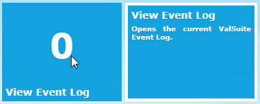
Here is a style for a image that will fade in i half a second, and after 1,5 second it will fade out in 1 second

<ResourceDictionary x:Class="foo.View.Styles.FadeOutImageStyle"
                    xmlns="http://schemas.microsoft.com/winfx/2006/xaml/presentation"
                    xmlns:x="http://schemas.microsoft.com/winfx/2006/xaml"
                    xmlns:mc="http://schemas.openxmlformats.org/markup-compatibility/2006" 
                    xmlns:d="http://schemas.microsoft.com/expression/blend/2008" 
                    mc:Ignorable="d">
    <Style x:Key="DefaultFadeImageStyle" TargetType="{x:Type Image}">
        <Style.Triggers>
            <Trigger Property="IsVisible" Value="True">
                <Trigger.EnterActions>
                    <BeginStoryboard>
                        <Storyboard>
                            <DoubleAnimation Storyboard.TargetProperty="Opacity" From="0.5" To="1.0" BeginTime="0:0:0" Duration="0:0:0.5"/>
                            <DoubleAnimation Storyboard.TargetProperty="Opacity" From="1.0" To="0.0" BeginTime="0:0:1.5" Duration="0:0:1"/>
                        </Storyboard>
                    </BeginStoryboard>
                </Trigger.EnterActions>
            </Trigger>
        </Style.Triggers>
    </Style>
</ResourceDictionary>

and of course can be used like

Style="{StaticResource DefaultFadeOutImageStyle}

Then a style for a plain squre ProgressBar without any glossy effects or gradient colors. This one I found here:

http://stackoverflow.com/questions/12871978/removing-gloss-from-progressbar

<ResourceDictionary x:Class="foo.View.Styles.ProgressBarStyle"
             xmlns="http://schemas.microsoft.com/winfx/2006/xaml/presentation"
             xmlns:x="http://schemas.microsoft.com/winfx/2006/xaml"
             xmlns:mc="http://schemas.openxmlformats.org/markup-compatibility/2006" 
             xmlns:d="http://schemas.microsoft.com/expression/blend/2008">
    <Style x:Key="DefaultProgressBar" TargetType="{x:Type ProgressBar}">
        <Setter Property="Background" Value="Transparent"/>
        <Setter Property="Template">
            <Setter.Value>
                <ControlTemplate TargetType="ProgressBar">
                    <Border BorderBrush="Transparent" BorderThickness="0" Background="Transparent" CornerRadius="0" Padding="0">
                        <Grid x:Name="PART_Track">
                            <Rectangle x:Name="PART_Indicator" HorizontalAlignment="Left" Fill="#00DB69"/>
                        </Grid>
                    </Border>
                </ControlTemplate>
            </Setter.Value>
        </Setter>
    </Style>
</ResourceDictionary>

Here is a style for WPF ToolTip that will look something like this:


<ResourceDictionary x:Class="foo.View.Styles.ToolTipStyles"
                    xmlns="http://schemas.microsoft.com/winfx/2006/xaml/presentation"
                    xmlns:x="http://schemas.microsoft.com/winfx/2006/xaml"
                    xmlns:mc="http://schemas.openxmlformats.org/markup-compatibility/2006" 
                    xmlns:d="http://schemas.microsoft.com/expression/blend/2008" 
                    mc:Ignorable="d">
    <Style x:Key="{x:Type ToolTip}" TargetType="ToolTip">
        <Setter Property="MinHeight" Value="100"/>
        <Setter Property="Placement" Value="Right"/>
        <Setter Property="HasDropShadow" Value="False"/>
        <Setter Property="Visibility" Value="{Binding Path=ToolTipVisible}"/>
        <Setter Property="Template">
            <Setter.Value>
                <ControlTemplate TargetType="ToolTip">
                    <Border BorderBrush="White" BorderThickness="4" Width="190" Height="{Binding Path=Height}" Background="{Binding Path=ToolTipBackgroundColor}" MinHeight="100">
                        <DockPanel VerticalAlignment="Top">
                            <TextBlock DockPanel.Dock="Top" 
                                       Text="{Binding Path=DescriptiveText}" 
                                       Visibility="{Binding Path=DescriptiveTextVisibleInToolTip}"
                                       FontSize="14" 
                                       FontWeight="Bold" 
                                       FontFamily="Verdana" 
                                       Foreground="White" 
                                       Margin="5" 
                                       TextWrapping="Wrap" 
                                       TextAlignment="Justify">
                                <TextBlock.Style>
                                    <Style TargetType="TextBlock">
                                        <Style.Triggers>
                                            <Trigger Property="Text" Value="{x:Null}">
                                                <Setter Property="Visibility" Value="Collapsed"/>
                                            </Trigger>
                                            <Trigger Property="Text" Value="">
                                                <Setter Property="Visibility" Value="Collapsed"/>
                                            </Trigger>
                                        </Style.Triggers>
                                    </Style>
                                </TextBlock.Style>
                            </TextBlock>
                            <TextBlock DockPanel.Dock="Top" Text="{Binding Path=ToolTip}" FontSize="10" FontWeight="Bold" FontFamily="Verdana" Foreground="White" Margin="5,0,5,0" TextWrapping="Wrap" TextAlignment="Justify"/>
                            <TextBlock/>
                        </DockPanel>
                    </Border>
                </ControlTemplate>
            </Setter.Value>
        </Setter>
        <Style.Triggers>
            <EventTrigger RoutedEvent="ToolTip.Opened">
                <BeginStoryboard>
                    <Storyboard>
                        <DoubleAnimation Storyboard.TargetProperty="Width" From="0.0" To="200" Duration="0:0:.5"/>
                        <DoubleAnimation Storyboard.TargetProperty="Opacity" From="0.0" To="1.0" Duration="0:0:1"/>
                    </Storyboard>
                </BeginStoryboard>
            </EventTrigger>
        </Style.Triggers>
    </Style>
</ResourceDictionary>

A DataGrid style that wiil make the DataGrid look like this:


<ResourceDictionary x:Class="foo.View.Styles.DataGridStyles"
                    xmlns="http://schemas.microsoft.com/winfx/2006/xaml/presentation"
                    xmlns:x="http://schemas.microsoft.com/winfx/2006/xaml"
                    xmlns:mc="http://schemas.openxmlformats.org/markup-compatibility/2006" 
                    xmlns:d="http://schemas.microsoft.com/expression/blend/2008" 
                    mc:Ignorable="d">
    <Style x:Key="DefaultSettingsDataGrid" TargetType="{x:Type DataGrid}">
        <Setter Property="IsEnabled" Value="{Binding Enable}"/>
        <Setter Property="Width" Value="{Binding DataGridWidth}"/>
        <Setter Property="HorizontalAlignment" Value="Left"/>
        <Setter Property="AlternatingRowBackground" Value="Beige"/>
        <Setter Property="AlternationCount" Value="2"/>
        <Setter Property="CanUserAddRows" Value="False"/>
        <Setter Property="CanUserDeleteRows" Value="False"/>
        <Setter Property="CanUserReorderColumns" Value="False"/>
        <Setter Property="CanUserResizeColumns" Value="False"/>
        <Setter Property="CanUserResizeRows" Value="False"/>
        <Setter Property="CanUserSortColumns" Value="False"/>
        <Setter Property="AutoGenerateColumns" Value="False"/>
        <Setter Property="HeadersVisibility" Value="None"/>
        <Setter Property="VerticalAlignment" Value="Center"/>
        <Setter Property="TextBlock.FontFamily" Value="Calibri"/>
        <Setter Property="TextBlock.FontSize" Value="14"/>
        <Setter Property="TextBlock.FontWeight" Value="Bold"/>
        <Setter Property="TextBlock.Foreground" Value="Black"/>
        <Setter Property="TextBlock.TextWrapping" Value="Wrap"/>
        <Setter Property="TextBlock.VerticalAlignment" Value="Center"/>
        <Setter Property="GridLinesVisibility" Value="None"/>
        <Setter Property="BorderBrush" Value="#FF009CDD"/>
        <Setter Property="BorderThickness" Value="3"/>
        <Style.Resources>
            <SolidColorBrush x:Key="{x:Static SystemColors.HighlightBrushKey}" Color="Transparent" />
            <SolidColorBrush x:Key="{x:Static SystemColors.ControlBrushKey}" Color="Transparent" />
            <SolidColorBrush x:Key="{x:Static SystemColors.HighlightTextBrushKey}" Color="Black" />
            <SolidColorBrush x:Key="{x:Static SystemColors.ControlTextBrushKey}" Color="Black" />
        </Style.Resources>
        <Style.Triggers>
            <Trigger Property="IsVisible" Value="True">
                <Trigger.EnterActions>
                    <BeginStoryboard>
                        <Storyboard>
                            <DoubleAnimation Storyboard.TargetProperty="Opacity" From="0.0" To="1.0" Duration="0:0:0.8"/>
                        </Storyboard>
                    </BeginStoryboard>
                </Trigger.EnterActions>
            </Trigger>
        </Style.Triggers>
    </Style>
</ResourceDictionary>

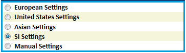
 A ComboBox, that look like this:


<ResourceDictionary x:Class="foo.View.Styles.FlatComboBoxStyles"
                    xmlns="http://schemas.microsoft.com/winfx/2006/xaml/presentation"
                    xmlns:x="http://schemas.microsoft.com/winfx/2006/xaml"
                    xmlns:mc="http://schemas.openxmlformats.org/markup-compatibility/2006" 
                    xmlns:d="http://schemas.microsoft.com/expression/blend/2008" 
                    mc:Ignorable="d">
    <Style x:Key="FlatComboBox" TargetType="{x:Type ComboBox}">
        <Setter Property="HorizontalAlignment" Value="Stretch"/>
        <Setter Property="HorizontalContentAlignment" Value="Right"/>
        <Setter Property="VerticalAlignment" Value="Top"/>
        <Setter Property="MinWidth" Value="100"/>
        <Setter Property="UIElement.SnapsToDevicePixels" Value="True"/>
        <Setter Property="ScrollViewer.HorizontalScrollBarVisibility" Value="Disabled"/>
        <Setter Property="ScrollViewer.VerticalScrollBarVisibility" Value="Auto"/>
        <Setter Property="ScrollViewer.CanContentScroll" Value="True"/>
        <Setter Property="TextElement.Foreground" Value="Black"/>
        <Setter Property="FrameworkElement.FocusVisualStyle" Value="{x:Null}"/>
        <Setter Property="BorderBrush" Value="Transparent"/>
        <Setter Property="BorderThickness" Value="0"/>
        <Setter Property="Background" Value="Transparent" />
    </Style>
</ResourceDictionary>

Now this is a bit more complex. I don't know if it could be done more elegantly.

Obvious I found this style somewhere, but unfortunately I’ve forgotten where. Sincere apologies to the author.

Here is what the vertical ScrollBar that will look like this:


This style is only for a vertical ScrollBar:

<ResourceDictionary x:Class="foo.View.Styles.ScrollViewerStyle"
                    xmlns="http://schemas.microsoft.com/winfx/2006/xaml/presentation"
                    xmlns:x="http://schemas.microsoft.com/winfx/2006/xaml"
                    xmlns:mc="http://schemas.openxmlformats.org/markup-compatibility/2006" 
                    xmlns:d="http://schemas.microsoft.com/expression/blend/2008" 
                    mc:Ignorable="d">
    <Style x:Key="DefaultScrollViewer" TargetType="{x:Type ScrollViewer}">
        <Setter Property="VerticalScrollBarVisibility" Value="Auto"/>
        <Setter Property="HorizontalScrollBarVisibility" Value="Hidden"/>
        <Setter Property="Background" Value="Transparent"/>
    </Style>

    <!-- SrollViewer ScrollBar Repeat Buttons (at each end) -->
    <Style x:Key="ScrollBarLineButton" TargetType="{x:Type RepeatButton}">
        <Setter Property="SnapsToDevicePixels" Value="True"/>
        <Setter Property="OverridesDefaultStyle" Value="true"/>
        <Setter Property="Focusable" Value="false"/>
        <Setter Property="Template">
            <Setter.Value>
                <ControlTemplate TargetType="{x:Type RepeatButton}">
                    <Border Name="Border" Margin="0" CornerRadius="0" Background="#FF009CDD" BorderThickness="1" BorderBrush="White">
                        <Path HorizontalAlignment="Center" VerticalAlignment="Center" Fill="#FF009CDD" Data="{Binding Path=Content, RelativeSource={RelativeSource TemplatedParent}}" />
                    </Border>
                    <ControlTemplate.Triggers>
                        <Trigger Property="IsPressed" Value="true">
                            <Setter TargetName="Border" Property="Background" Value="#FF009CDD" />
                        </Trigger>
                        <Trigger Property="IsEnabled" Value="false">
                            <Setter Property="Foreground" Value="Gray"/>
                        </Trigger>
                    </ControlTemplate.Triggers>
                </ControlTemplate>
            </Setter.Value>
        </Setter>
    </Style>
    <!-- SrollViewer ScrollBar Repeat Buttons (The part in the middle, not the thumb the long area between the buttons ) -->
    <Style x:Key="ScrollBarPageButton" TargetType="{x:Type RepeatButton}">
        <Setter Property="SnapsToDevicePixels" Value="True"/>
        <Setter Property="OverridesDefaultStyle" Value="true"/>
        <Setter Property="IsTabStop" Value="false"/>
        <Setter Property="Focusable" Value="false"/>
        <Setter Property="Template">
            <Setter.Value>
                <ControlTemplate TargetType="{x:Type RepeatButton}">
                    <Border Background="Transparent" />
                </ControlTemplate>
            </Setter.Value>
        </Setter>
    </Style>
    <!-- ScrollViewer ScrollBar Thumb, that part that can be dragged up/down or left/right Buttons -->
    <Style x:Key="ScrollBarThumb" TargetType="{x:Type Thumb}">
        <Setter Property="SnapsToDevicePixels" Value="True"/>
        <Setter Property="OverridesDefaultStyle" Value="true"/>
        <Setter Property="IsTabStop" Value="false"/>
        <Setter Property="Focusable" Value="false"/>
        <Setter Property="Template">
            <Setter.Value>
                <ControlTemplate TargetType="{x:Type Thumb}">
                    <Border CornerRadius="0" Background="{TemplateBinding Background}" BorderThickness="1" BorderBrush="White"/>
                </ControlTemplate>
            </Setter.Value>
        </Setter>
    </Style>

    <ControlTemplate x:Key="VerticalScrollBar" TargetType="{x:Type ScrollBar}">
        <Grid >
            <Grid.RowDefinitions>
                <RowDefinition MaxHeight="18"/>
                <RowDefinition Height="0.00001*"/>
                <RowDefinition MaxHeight="18"/>
            </Grid.RowDefinitions>
            <Border Grid.RowSpan="3" CornerRadius="0" Background="White" />
            <RepeatButton Grid.Row="0" Style="{StaticResource ScrollBarLineButton}" Height="18" Command="ScrollBar.LineUpCommand" Content="M 0 4 L 8 4 L 4 0 Z" />
            <Track Name="PART_Track" Grid.Row="1" IsDirectionReversed="true">
                <Track.DecreaseRepeatButton>
                    <RepeatButton Style="{StaticResource ScrollBarPageButton}" Command="ScrollBar.PageUpCommand" />
                </Track.DecreaseRepeatButton>
                <Track.Thumb>
                    <Thumb Style="{StaticResource ScrollBarThumb}" Margin="0,0,0,0" Background="#FF009CDD"/>
                </Track.Thumb>
                <Track.IncreaseRepeatButton>
                    <RepeatButton Style="{StaticResource ScrollBarPageButton}" Command="ScrollBar.PageDownCommand" />
                </Track.IncreaseRepeatButton>
            </Track>
            <RepeatButton Grid.Row="3" Style="{StaticResource ScrollBarLineButton}" Height="18" Command="ScrollBar.LineDownCommand" Content="M 0 0 L 4 4 L 8 0 Z"/>
        </Grid>
    </ControlTemplate>
    <!-- Style for overall  ScrollBar -->
    <Style x:Key="{x:Type ScrollBar}" TargetType="{x:Type ScrollBar}">
        <Setter Property="SnapsToDevicePixels" Value="True"/>
        <Setter Property="OverridesDefaultStyle" Value="true"/>
        <Style.Triggers>
            <Trigger Property="Orientation" Value="Vertical">
                <Setter Property="Width" Value="18"/>
                <Setter Property="Height" Value="Auto" />
                <Setter Property="Template"
                        Value="{StaticResource VerticalScrollBar}" />
            </Trigger>
        </Style.Triggers>
    </Style>

    <!-- Style for overall  ScrollViewer -->
    <Style x:Key="FavsScrollViewer" TargetType="{x:Type ScrollViewer}">
        <Setter Property="OverridesDefaultStyle" Value="True"/>
        <Setter Property="Template">
            <Setter.Value>
                <ControlTemplate TargetType="{x:Type ScrollViewer}">
                    <Grid>
                        <Grid.ColumnDefinitions>
                            <ColumnDefinition Width="Auto"/>
                            <ColumnDefinition/>
                        </Grid.ColumnDefinitions>
                        <Grid.RowDefinitions>
                            <RowDefinition/>
                            <RowDefinition Height="Auto"/>
                        </Grid.RowDefinitions>
                        <ScrollContentPresenter Grid.Column="1"/>
                        <ScrollBar Name="PART_VerticalScrollBar" Value="{TemplateBinding VerticalOffset}" Maximum="{TemplateBinding ScrollableHeight}" ViewportSize="{TemplateBinding ViewportHeight}" Visibility="{TemplateBinding ComputedVerticalScrollBarVisibility}"/>
                        <ScrollBar Name="PART_HorizontalScrollBar" Orientation="Horizontal" Grid.Row="1" Grid.Column="1" Value="{TemplateBinding HorizontalOffset}" Maximum="{TemplateBinding ScrollableWidth}" ViewportSize="{TemplateBinding ViewportWidth}" Visibility="{TemplateBinding ComputedHorizontalScrollBarVisibility}"/>
                    </Grid>
                </ControlTemplate>
            </Setter.Value>
        </Setter>
    </Style>
</ResourceDictionary>


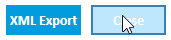
And a style for a plain button, looking like this:

<ResourceDictionary x:Class="Ellab.WPF.View.Styles.ButtonStyle" 
                    xmlns="http://schemas.microsoft.com/winfx/2006/xaml/presentation"
                    xmlns:x="http://schemas.microsoft.com/winfx/2006/xaml"
                    xmlns:mc="http://schemas.openxmlformats.org/markup-compatibility/2006" 
                    xmlns:d="http://schemas.microsoft.com/expression/blend/2008" >
    <Style x:Key="DefaultButtonStyle" TargetType="{x:Type Button}">
        <Setter Property="BorderThickness" Value="0"/>
        <Setter Property="Background" Value="#FF009CDD"/>
        <Setter Property="TextElement.FontSize" Value="14"/>
        <Setter Property="TextElement.FontWeight" Value="Bold"/>
        <Setter Property="TextElement.FontFamily" Value="Calibri"/>
        <Setter Property="TextElement.Foreground" Value="White"/>
        <Style.Triggers>
            <Trigger Property="IsMouseOver" Value="True">
                <Setter Property="BorderBrush" Value="#FF123F74"/>
                <Setter Property="BorderThickness" Value="2"/>
            </Trigger>
            <Trigger Property="IsMouseOver" Value="False">
                <Setter Property="BorderThickness" Value="0"/>
            </Trigger>
            <Trigger Property="IsDefault" Value="True">
                <Setter Property="BorderBrush" Value="#FF123F74"/>
                <Setter Property="BorderThickness" Value="2"/>
            </Trigger>
        </Style.Triggers>
    </Style>
</ResourceDictionary>


As always, feel free to comment, or ask.


An example of a ‘ViewModelBase’ class, that implements INotifyPropertyChanged.

public abstract class ViewModelBase : INotifyPropertyChanged
{
    public event PropertyChangedEventHandler PropertyChanged;

    protected virtual void OnPropertyChanged([CallerMemberName] string propertyName = null)
    {
        PropertyChanged?.Invoke(this, new PropertyChangedEventArgs(propertyName));
    }
    protected virtual bool SetProperty<T>(ref T storage, T value, [CallerMemberName] string propertyName = "")
    {
        if (EqualityComparer<T>.Default.Equals(storage, value))
            return false;
        storage = value;
        this.OnPropertyChanged(propertyName);
        return true;
    }
}

And use it like this:

private string _totalTime;
public string TotalTime
{
    get { return _totalTime; }
    set
    {
        if (_totalTime != value)
        {
            _totalTime = value;
            OnPropertyChanged();
        }
    }
}

... or even:

private string _totalTime;
public string TotalTime
{
    get { return _totalTime; }
    set { SetProperty(ref _totalTime, value); }
}

As always, feel free to comment, or ask.


An MVVMresources.xaml example.

Published 10/30/2014 by Christian
Tags: , , ,

OK - a quick WPF/XAML/MVVM post. Mostly for my own benefit, so I can remember the syntax. This one about a MVVM resource file.

<ResourceDictionary x:Class="FooBar.MVVMResources"
                    xmlns="http://schemas.microsoft.com/winfx/2006/xaml/presentation"
                    xmlns:x="http://schemas.microsoft.com/winfx/2006/xaml"
                    xmlns:mc="http://schemas.openxmlformats.org/markup-compatibility/2006" 
                    xmlns:d="http://schemas.microsoft.com/expression/blend/2008"
                    xmlns:vm="clr-namespace:foo.ViewModel"
                    xmlns:vw="clr-namespace:foo.View"
                    xmlns:vm_common="clr-namespace:bar.ViewModel;assembly=BarAssembly"
                    xmlns:vw_common="clr-namespace:bar.View;assembly=BarAssembly">

    <DataTemplate DataType="{x:Type vm:fooViewModel}">
        <vw:fooView/>
    </DataTemplate>

    <DataTemplate DataType="{x:Type vm_common:barViewModel}">
        <vw_common:barView/>
    </DataTemplate>
</ResourceDictionary>


As always, feel free to comment, or ask.


GIF animation in WPF

Published 10/30/2014 by Christian
Tags: , , ,

Due to the imperfect scaling ability of GIF images, these are deprecated in WPF.

A work around though can be found here:

https://code.msdn.microsoft.com/windowsdesktop/CSWPFAnimatedGIF-3029aeb9/sourcecode?fileId=26331&pathId=41660693

This is how the control looks like:

/****************************** Module Header ******************************\
Module Name:	AnimatedGIFControl.cs
Project:	    CSWPFAnimatedGIF
Copyright (c) Microsoft Corporation.

The CSWPFAnimatedGIF demonstrates how to implement 
an animated GIF image in WPF.

This source is subject to the Microsoft Public License.
See http://www.microsoft.com/opensource/licenses.mspx#Ms-PL.
All other rights reserved.

THIS CODE AND INFORMATION IS PROVIDED "AS IS" WITHOUT WARRANTY OF ANY KIND, 
EITHER EXPRESSED OR IMPLIED, INCLUDING BUT NOT LIMITED TO THE IMPLIED 
WARRANTIES OF MERCHANTABILITY AND/OR FITNESS FOR A PARTICULAR PURPOSE.
\***************************************************************************/

using System;
using System.Drawing;
using System.Runtime.InteropServices;
using System.Windows;
using System.Windows.Interop;
using System.Windows.Media.Imaging;
using System.Windows.Threading;

namespace Ellab.WPF.Utilities
{
    public class AnimatedGIFControl : System.Windows.Controls.Image
    {
        private Bitmap _bitmap; // Local bitmap member to cache image resource
        private BitmapSource _bitmapSource;
        public delegate void FrameUpdatedEventHandler();
            

        /// <summary>
        /// Delete local bitmap resource
        /// Reference: http://msdn.microsoft.com/en-us/library/dd183539(VS.85).aspx
        /// </summary>
        [DllImport("gdi32.dll", CharSet = CharSet.Auto, SetLastError = true)]
        static extern bool DeleteObject(IntPtr hObject);

        /// <summary>
        /// Override the OnInitialized method
        /// </summary>
        protected override void OnInitialized(EventArgs e)
        {
            base.OnInitialized(e);
            this.Loaded += new RoutedEventHandler(AnimatedGIFControl_Loaded);
            this.Unloaded += new RoutedEventHandler(AnimatedGIFControl_Unloaded);           
        }

        /// <summary>
        /// Load the embedded image for the Image.Source
        /// </summary>
       
        void AnimatedGIFControl_Loaded(object sender, RoutedEventArgs e)
        {
            try
            {
                // Get GIF image from Resources
                if (Ellab.WPF.Properties.Resources.ProgressIndicator != null)
                {
                    _bitmap = Ellab.WPF.Properties.Resources.ProgressIndicator;
                    Width = _bitmap.Width;
                    Height = _bitmap.Height;

                    _bitmapSource = GetBitmapSource();
                    Source = _bitmapSource;

                    StartAnimate();
                }
            }
            catch (Exception ex) { Ellab.Debug.GlobalDebug.debugForm.WriteText(ex); }
        }

        /// <summary>
        /// Close the FileStream to unlock the GIF file
        /// </summary>
        private void AnimatedGIFControl_Unloaded(object sender, RoutedEventArgs e)
        {
            StopAnimate();
        }

        /// <summary>
        /// Start animation
        /// </summary>
        public void StartAnimate()
        {
            ImageAnimator.Animate(_bitmap, OnFrameChanged);
        }

        /// <summary>
        /// Stop animation
        /// </summary>
        public void StopAnimate()
        {
            ImageAnimator.StopAnimate(_bitmap, OnFrameChanged);
        }

        /// <summary>
        /// Event handler for the frame changed
        /// </summary>
        private void OnFrameChanged(object sender, EventArgs e)
        {
            Dispatcher.BeginInvoke(DispatcherPriority.Normal,
                                   new FrameUpdatedEventHandler(FrameUpdatedCallback));
        }

        private void FrameUpdatedCallback()
        {
            ImageAnimator.UpdateFrames();

            if (_bitmapSource != null)
                _bitmapSource.Freeze();

            // Convert the bitmap to BitmapSource that can be display in WPF Visual Tree
            _bitmapSource = GetBitmapSource();
            Source = _bitmapSource;
            InvalidateVisual();
        }

        private BitmapSource GetBitmapSource()
        {
            IntPtr handle = IntPtr.Zero;                

            try
            {
                handle = _bitmap.GetHbitmap();
                _bitmapSource = Imaging.CreateBitmapSourceFromHBitmap(
                    handle, IntPtr.Zero, Int32Rect.Empty, BitmapSizeOptions.FromEmptyOptions());
            }
            finally
            {
                if (handle != IntPtr.Zero)
                    DeleteObject(handle);
            }

            return _bitmapSource;
        }

    }
}

And the control can be used like this. First set the namespace:

xmlns:local="clr-namespace:Ellab.WPF.Utilities;assembly=Ellab.WPF"

Then use it like

<local:AnimatedGIFControl x:Name="GIFCtrl"/>

As always, feel free to comment, or ask.


De- and Serialize XML

Published 3/13/2014 by Christian
using System;
using System.Collections.Generic;
using System.IO;
using System.Linq;
using System.Text;
using System.Threading.Tasks;
using System.Xml.Serialization;

namespace baltz
{
    public class Utilities
    {
        /// <summary>
        /// Will read an XML file, containing an XML-serialized object of type 't', and return the deserialize object
        /// </summary>
        /// <param name="fileName">The full path of the file in question</param>
        /// <param name="t">The type of the object in the XML-serialized file (eg. this.GetType())</param>
        /// <exception cref="FileNotFoundException"></exception>
        /// <returns>An deserialize object of type 't'</returns>
        public object ReadXML(string fileName, Type t)
        {
            if (!File.Exists(fileName))
            {
                throw new FileNotFoundException();
            }
            object xmlObject;
            using (FileStream reader = new FileStream(fileName, FileMode.Open, FileAccess.Read))
            {
                XmlSerializer serializer = new XmlSerializer(t);
                xmlObject = serializer.Deserialize(reader);
            }
            return xmlObject;
        }

        /// <summary>
        /// Will XML-serialize 'item' and write it to 'fileName'
        /// </summary>
        /// <param name="item">The object in question. Must be XML-serializeable, and declared as such</param>
        /// <param name="fileName">The full path of the file in question</param>
        public void WriteXML(object item, string fileName)
        {
            if (File.Exists(fileName))
            {
                File.Delete(fileName);
            }
            XmlSerializer serializer = new XmlSerializer(item.GetType());

            using (TextWriter writer = new StreamWriter(fileName))
            {
                serializer.Serialize(writer, item);
            }
        }
    }
}